One Credit
I originally worked with One, a Brazilian fintech offering personal loans, and later rebranded it to better reflect its mission and build trust—making the borrowing experience feel more approachable and human.

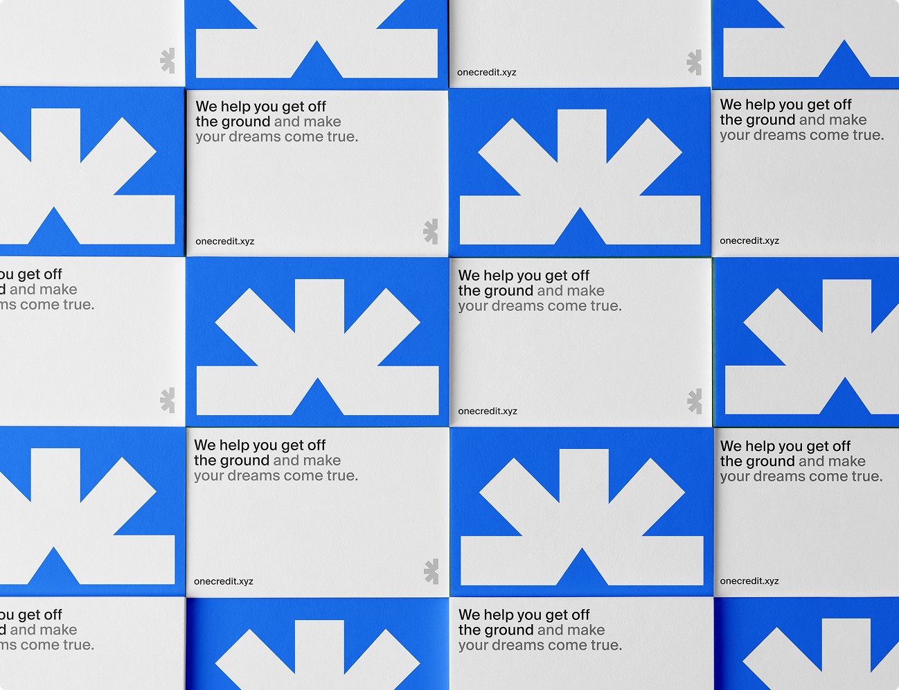
Visual mockup for One
Visual presentation made on Jitter
Brand Strategy &Visual Identity
The rebrand for One focused on creating a more trustworthy, modern presence through a clear and intentional visual system. I designed a neutral color palette anchored in white and grey, using vibrant accents to draw attention to key actions and content. The goal was to bring calm and structure to an otherwise stressful product space.
Alongside the visual work, I developed a simple but consistent tone of voice that felt human, not corporate. From layout spacing to typography choices, every decision aimed to reduce friction and make the borrowing experience feel supportive, straightforward, and approachable—especially for users unfamiliar with financial products.

Visual mockup for One

Business card for One Credit

Hero section for Brand Guidelines
Brand Guidelines
To support the rebrand, I created a lightweight brand guideline that defines the essential visual elements—logo, colors, typography, and imagery. While not exhaustive, it provides clear direction to maintain consistency across key touchpoints and communicate the brand’s tone effectively.
The system is built around a bold, geometric logomark, a balanced color palette, and clean Swiss-inspired typography. It also includes guidance on visual do’s and don’ts, supported by mockups showing how the identity extends across digital and physical contexts.
A chance to reimagine a brand I once worked with through a more focused, refined design system.
This case study was a chance to streamline a brand experience across web and identity. It focused on practical improvements—clarity, consistency, and a stronger visual system within a compact landing page.
Softwares I used:
Figma
Framer
Photoshop
Jitter
ChatGPT